



Features
Section titled “Features”- ✅ Supports both light and dark mode images
- ✅ Uses Astro's optimized Image component for performance
- ✅ Supports the
~/imagesalias path - ✅ Automatic image optimization and processing
- ✅ TypeScript support with strict typing
- ✅ Follows Starlight's theming conventions (
light:sl-hiddenanddark:sl-block)
Live Demo
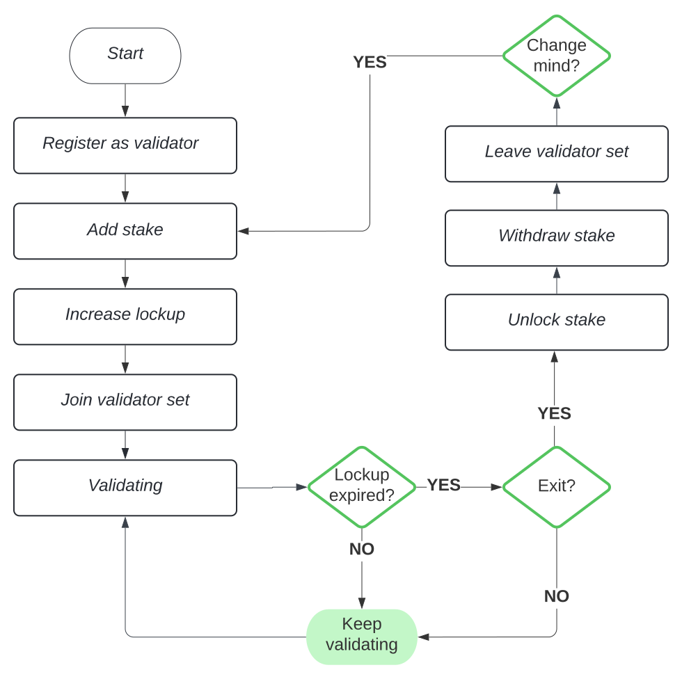
Section titled “Live Demo”Try switching between light and dark mode to see the component in action:
Basic Usage
Section titled “Basic Usage”---import ThemedImage from '~/components/ThemedImage';---
<ThemedImage alt="Staking Flow" sources={{ light: '~/images/staking-light.svg', dark: '~/images/staking-dark.svg', }}/>With Custom Dimensions
Section titled “With Custom Dimensions”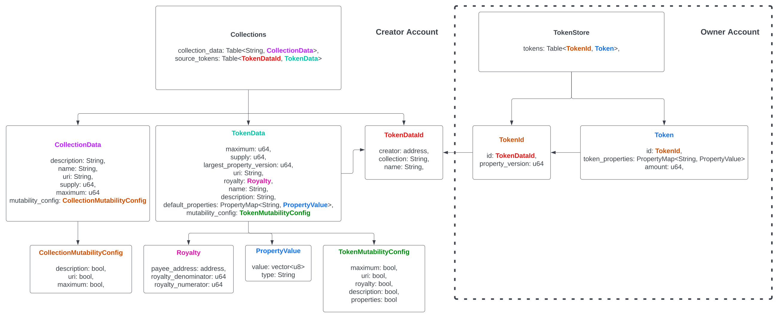

<ThemedImage alt="Aptos Token Standard Flow" sources={{ light: '~/images/aptos-token-standard-flow.svg', dark: '~/images/aptos-token-standard-flow-dark.svg', }} width={600} height={400}/>With Custom CSS Class
Section titled “With Custom CSS Class”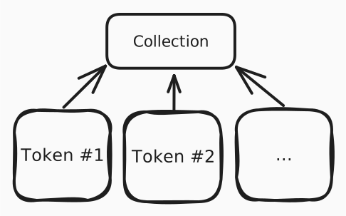
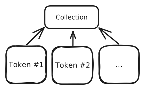
<ThemedImage alt="Digital Asset" sources={{ light: '~/images/digital-asset-light.svg', dark: '~/images/digital-asset-dark.svg', }} class="rounded-lg shadow-md"/>Using Imported Images
Section titled “Using Imported Images”---import lightImage from '~/images/my-light-image.png';import darkImage from '~/images/my-dark-image.png';import ThemedImage from '~/components/ThemedImage';---
<ThemedImage alt="My Image" sources={{ light: lightImage, dark: darkImage, }}/>| Prop | Type | Required | Default | Description |
| ---------- | ------------------------------------------------------------------- | -------- | --------- | --------------------------------------------------- |
| alt | string | ✅ | - | Alt text for the image (required for accessibility) |
| sources | { light: string \| ImageMetadata, dark: string \| ImageMetadata } | ✅ | - | Object containing light and dark mode image sources |
| width | number | ❌ | - | Image width in pixels |
| height | number | ❌ | - | Image height in pixels |
| loading | 'lazy' \| 'eager' | ❌ | 'lazy' | Image loading strategy |
| decoding | 'async' \| 'sync' \| 'auto' | ❌ | 'async' | Image decoding strategy |
| class | string | ❌ | '' | Additional CSS classes to apply |
How It Works
Section titled “How It Works”The component renders two <Image> components:
- Light mode image: Visible in light theme, hidden in dark theme (
light:sl-block dark:sl-hidden) - Dark mode image: Hidden in light theme, visible in dark theme (
light:sl-hidden dark:sl-block)
Both images use Astro's optimized <Image> component, which provides:
- Automatic image optimization
- WebP/AVIF format conversion
- Responsive image generation
- Lazy loading by default
- Cumulative Layout Shift (CLS) prevention
Image Path Aliases
Section titled “Image Path Aliases”The component supports the ~/images alias configured in your Astro project:
export default defineConfig({ vite: { resolve: { alias: { "~/images": fileURLToPath(new URL("./src/assets/images", import.meta.url)), }, }, },});This allows you to use paths like ~/images/my-image.svg instead of relative paths.
CSS Classes
Section titled “CSS Classes”The component uses Starlight's theming classes:
light:sl-block- Shows element in light modedark:sl-hidden- Hides element in dark modelight:sl-hidden- Hides element in light modedark:sl-block- Shows element in dark mode
More Examples
Section titled “More Examples”Here are additional examples showing different use cases:



